01
when the 55-year-old semiologist roland barthes published his book ‚the empire of signs‘, the japanese sign/image combination, foreign to him, was reason and joy enough to provide a counter-draft to what he called western narcissism by diving comfortably into the unknown. released in 1970, the work dissects language, its form, meaning and the sense that unites the two. the 1982 film ‚blade runner‘ still exhales the multi-faceted horror of various colliding and unintentionally interlocked cultures. from a compressed, roughly globalized, contemporary perspective, the childlike rejection of one’s own cultural power structures is formulated in the recognition of the other, the foreign.
02
in fact, it is supercapitalism, unleashed in the eighties, that is transforming the world of signs and images of the western hemisphere, limited to control and security systems so far, into an advertising wonderland of brands in urgend need of representation. the logo finds its way into this originally letterbased side of the globe, the form-permeated minimization of the now increasingly powerful super-presence of goods. what made the researching frenchman reach for pen and paper less than two decades earlier now becomes a permanent opera of signs, the pac men of the victory-drunk hero of the late 20th century – marketing and its design.
03
the flood of minimized, reduced forms and signs has taken hold of the europeans, who had previously been rather discreetly sprinkled with visuals, and the change has been complete since the introduction of private television in the mid-eighties at the latest. like most others of his generation, the belgian alain biltereyst, born in 1965, was taught the new way of dealing with signs at school, so to speak. together they grow and conquer their worlds. biltereyst will deal with them for the rest of his life and transfer their appearance into his work. the artist clearly contrasts the gray zone between applied and free art with pure abstraction. the logo as a sign plays less of a role here than its brand design, which unfolds onto the object to be shaped in each case. like a panopticon of concave and convex mirrors, their formation sometimes flows into the most adventurous inventions.
04
precisely these graphic emergency solutions, which are not consumed by sublime geometry and are subject to the place and the moment, are his focus. biltereyst translates the sources of inspiration, injured by traces of use and resulting from the weather, into his art by counteracting their damage with painterly finesse. the artists works, which are based on several layers of paint, allow glimpses here and there into deeper zones and, with these vintage eye candies, adeptly reflect their flavored originals. that way, they stand out in the small, in the detail, rather than drowning in the great perfection of mainstream abstraction.
05
in the style of a new objectivity, biltereyst thus succeeds in turning back the clock before the time of max weber’s disenchantment of the world, who formulated the development of early capitalism in the sociological concept of occidental rationalism. the artist can easily counter even the nastiest accusation being a lovingly playful realist by adding just a little more pre-rational blurring to his reduced formal language. in his tearful ‚blade runner‘ death scene, the replicant roy confesses that he has seen things we would never believe. and the chorus echoes back loudly – us too, us too.
martin eugen raabenstein, 2023
more at biltereyst.com
alain biltereyst

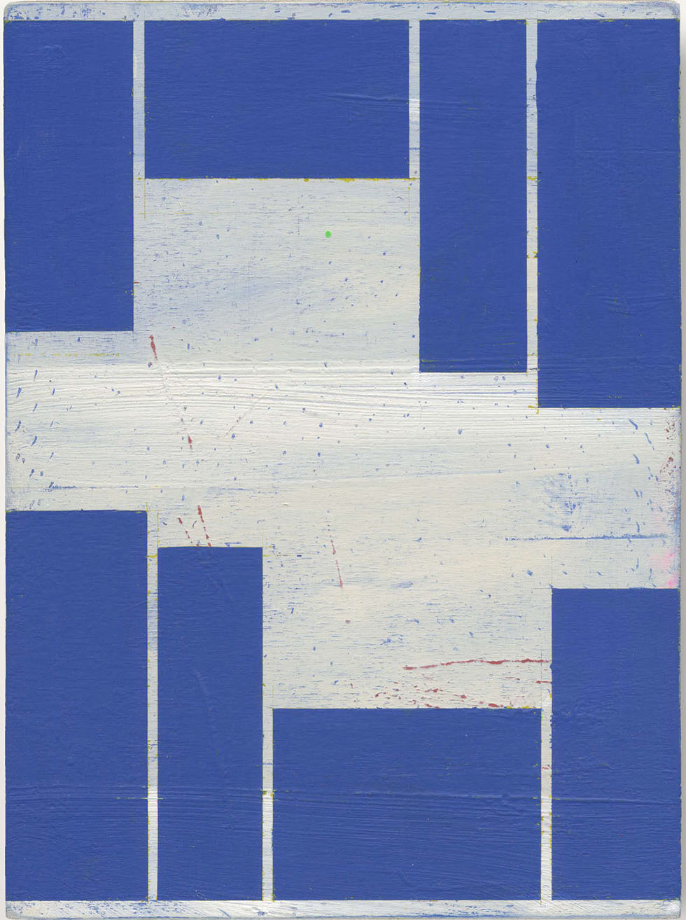
alain biltereyst
untitled, 26 x 19 cm,
acrylic on wood, 2015
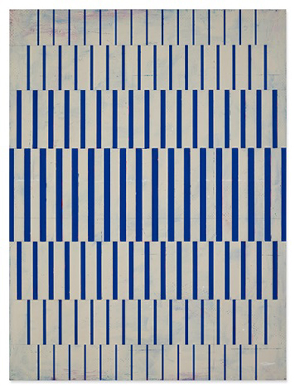
alain biltereyst
untitled, 117,8 x 87,6 cm
acrylic on panel, 2019
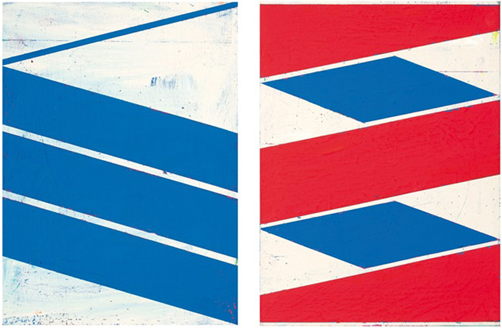
alain biltereyst
untitled (207-3) / untitled (411-3), 117,8 x 87,6 cm each
acrylic on panel, 2015 / 2016
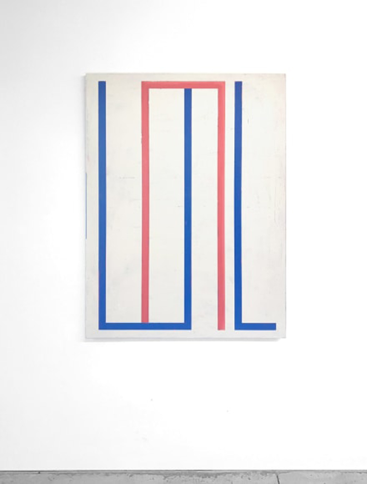
alain biltereyst
untitled, 117,8 x 87,6 cm
acrylic on panel, 2019
alain biltereyst
01
when the 55-year-old semiologist roland barthes published his book ‚the empire of signs‘, the japanese sign/image combination, foreign to him, was reason and joy enough to provide a counter-draft to what he called western narcissism by diving comfortably into the unknown. released in 1970, the work dissects language, its form, meaning and the sense that unites the two. the 1982 film ‚blade runner‘ still exhales the multi-faceted horror of various colliding and unintentionally interlocked cultures. from a compressed, roughly globalized, contemporary perspective, the childlike rejection of one’s own cultural power structures is formulated in the recognition of the other, the foreign.
02
in fact, it is supercapitalism, unleashed in the eighties, that is transforming the world of signs and images of the western hemisphere, limited to control and security systems so far, into an advertising wonderland of brands in urgend need of representation. the logo finds its way into this originally letterbased side of the globe, the form-permeated minimization of the now increasingly powerful super-presence of goods. what made the researching frenchman reach for pen and paper less than two decades earlier now becomes a permanent opera of signs, the pac men of the victory-drunk hero of the late 20th century – marketing and its design.
03
the flood of minimized, reduced forms and signs has taken hold of the europeans, who had previously been rather discreetly sprinkled with visuals, and the change has been complete since the introduction of private television in the mid-eighties at the latest. like most others of his generation, the belgian alain biltereyst, born in 1965, was taught the new way of dealing with signs at school, so to speak. together they grow and conquer their worlds. biltereyst will deal with them for the rest of his life and transfer their appearance into his work. the artist clearly contrasts the gray zone between applied and free art with pure abstraction. the logo as a sign plays less of a role here than its brand design, which unfolds onto the object to be shaped in each case. like a panopticon of concave and convex mirrors, their formation sometimes flows into the most adventurous inventions.
04
precisely these graphic emergency solutions, which are not consumed by sublime geometry and are subject to the place and the moment, are his focus. biltereyst translates the sources of inspiration, injured by traces of use and resulting from the weather, into his art by counteracting their damage with painterly finesse. the artists works, which are based on several layers of paint, allow glimpses here and there into deeper zones and, with these vintage eye candies, adeptly reflect their flavored originals. that way, they stand out in the small, in the detail, rather than drowning in the great perfection of mainstream abstraction.
05
in the style of a new objectivity, biltereyst thus succeeds in turning back the clock before the time of max weber’s disenchantment of the world, who formulated the development of early capitalism in the sociological concept of occidental rationalism. the artist can easily counter even the nastiest accusation being a lovingly playful realist by adding just a little more pre-rational blurring to his reduced formal language. in his tearful ‚blade runner‘ death scene, the replicant roy confesses that he has seen things we would never believe. and the chorus echoes back loudly – us too, us too.
martin eugen raabenstein, 2023
more at biltereyst.com

alain biltereyst

alain biltereyst
untitled, 26 x 19 cm,
acrylic on wood, 2015

alain biltereyst
untitled, 117,8 x 87,6 cm
acrylic on panel, 2019

alain biltereyst
untitled (207-3) / untitled (411-3), 117,8 x 87,6 cm each
acrylic on panel, 2015 / 2016

alain biltereyst
untitled, 117,8 x 87,6 cm
acrylic on panel, 2019
